

Display typography
This paper is extracted out of the manual for the CompuPhase product "Éclat! Informer". Éclat! Informer is a text database/browser, somewhat akin to Microsoft WinHelp or Internet browsers. The design goal for Éclat! Informer was to create a system with which you could create high quality electronic documentation; the intent was to replace (some of the) current "paper" documentation.
To reach that goal, the focus was on:
- Searching and browsing: the system needed to provide several, structured and non-structured, paths to the text, so that users find answers to their immediate questions and find hints to questions that they did not know they had.
- Reading: trying to replace a book by a computer screen is pretty ambitious. You will have to compromise on many design elements: use few colours, take special care of white space, etc.
Éclat! Informer is no longer available as a shrink-wrapped product, but the knowledge is not lost. If you have a need for a high-speed special-purpose browser, please do not hesitate to contact us.
For more information on typography, refer to the bibliography at the end of this paper.
Display typography
Letters are things, not pictures of things. - Eric Gill
Typography is a skill and an art. It is also very conservative. The letter shapes that we refer to as "modern type" are in fact over 150 years old. There is some justification for this conservatism: we have not yet fully understood the physical and psychological aspects of reading. To illustrate this, sans serif typefaces have, since their inception in 1816, inspired numerous flaming debates about the legibility and aesthetics. But even today, although we are now amply accustomed to sans serif letters and although numerous experiments have been conducted, there is no consensus on whether sans serif fonts improve or decrease legibility. The large amount of research on the subject is inconclusive.
Our typographic knowledge evolves this slow, because reading performance is difficult to measure. Reading is a very intelligent behaviour. Even when letters are barely decodable, we read the text without much difficulty since we see the letters in their context. One way to test the appropriateness of a typeface is to pull the letters out of their context. For this purpose, you can either use nonsense texts (the most famous of these texts starts with "Lorem ipsum dolor"), or use a standard text with deliberate spelling errors (proofreading tests).
The criticism on these tests is that people do not read individual letters. The eye picks groups of letters or even complete words. Studies on reading for comprehension attempt to simulate the real reading process by testing how much people understand from texts they just read and by measuring their fatigue. Getting decisive results from tests on reading for comprehension is, however, rather difficult. Objectively measuring fatigue is not easy and what people understand from a text is influenced by what they already know.
Early research on the visual quality of computer terminal displays stemmed from IBM's laboratories (the Thomas Watson Research Division) under the direction of J.D. Gould in 1968. That research exhibited that the flicker, character forming and luminance contrast of the displays of those days were inadequate for reading for longer periods.
Nearly twenty years later, research papers from the same laboratories acknowledged that, despite continuous product improvements, reading is still approximately 25% slower from normal displays than from equivalent text on paper [Gould 1987].
Although no precise reason has been found that explains why reading from screen is slower than reading from paper, the most probable cause is the quality of the letters themselves. Experiments with high quality displays [Muter 1991] found significantly better reading performance than the studies by Gould, and by Wilkinson and Robinshaw [Gould 1987, Wilkinson 1987].
The key in making electronic documentation more successful is to improve the letter quality. The hardware solution to this would be displays with 300 dots per inch (a resolution of approximately 3000x2300 on a 14 inch monitor. Until hardware solutions are commercially viable, we must turn to the software solution, which is to adapt the letter forms in a way that they are better suited to low resolution devices (such as a computer display).
Bitmap or vector?
Currently, the debate in Desk Top Publishing on fonts is whether they should be stored as outlines (vectors, Bézier curves or splines) or as bitmaps. Most modern font technologies use outline formats, although bitmap fonts are still used for most screen fonts in graphical user interfaces.
The biggest benefits that outline fonts have over bitmap fonts is that they can be scaled up to very large sizes without much quality loss, and that they take less memory or disk space on large sizes. An unscaled bitmap font gives the best possible letter quality, but scaling a bitmap font results in rapid degradation in quality. Storing all needed sizes of a typeface as unscaled full size bitmap fonts, on the other hand, requires a lot of disk and memory space. Where bitmap fonts have problems at large sizes, outline fonts have difficulties at small sizes. The quality of letter shapes of vector fonts is generally inferior to bitmap fonts, and especially so when the character matrix is small (a character matrix, such as presented in figure 1 is called a glyph).
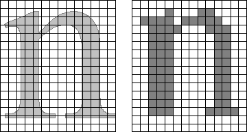
Figure 1 - Outline fonts create distorted characters at small sizes
Computer displays usually have a resolution of 50 to 100 dpi (dots per inch). This is far lower than the 300 dpi resolution that is common for laser printers, and for which outline fonts are designed. At these low resolutions, the number of dots that are available to form a character is limited. Even at a moderately high resolution, the strokes of an outline font will often fall between the grid lines of the dot matrix that must form the character (see figure 1). In this figure, a pixel in the grid is set to black if 50% or more of the grid box is covered by the character outline. As can be appreciated, simple algorithmic scaling does not suffice, and heuristic algorithms are needed to preserve the letter form. These heuristics are nowadays referred to as hints.
Hinting, however, does not include the more radical changes in letter shape, such as changing the x-height. But when a complete letter can only be 10 pixels high (not uncommon for a computer display), adding one pixel to the x-height can change the font from barely decodable to fairly readable. Figure 2 shows the "New York" font from the Apple Macintosh (a bitmap font). Notice how the design of the letter "w" changes at each size as a compromise between readability and desired letter shape. Also notice that the x-height (in relation to the height of the complete letter) of the smallest sample is higher than that of the largest sample. This is especially apparent in the counter (the "o" shaped part) of the letters "b".

Figure 2 - Differences in design for various sizes of the same letters (scaled 200%)
Outline fonts are usually based on a traditional typeface design, a design that was intended for lead type or for digital typesetters (resolutions of 2000 dpi or higher). Because they are only used at one size and resolution, bitmap fonts are less constrained to look exactly like their high resolution cousin. The designer of the bitmap fonts can avoid some of the features of the traditional typeface, such as thin joins and hairlines. In addition, the font designer can use hardware properties and limitations (for example, due to phosphor spreading, light pixels on a dark background are larger than dark pixels on a light background) to his or her advantage.
The conclusion is that bitmapped fonts are the preferred format for best legibility on computer displays. This leaves us with two problems: we need fonts at various sizes (while bitmaps cannot be scaled without distortion) and we need fonts that are mapped to different resolutions. In the standard VGA resolution (640 x 480), a 10 points font can be represented with a font that is 16 pixels high. In a common SuperVGA resolution of 800 x 600, that 10 points font would need to be 20 pixels high to get the same perceptual height. Note that we must now be careful in distinguishing the perceptual size of a font in (points) and its physical size (in pixels). What it sums up to is that the character bitmaps for a font must be created in different sizes (as in figure 2) and in different resolutions.
Letter spacing
Related to the glyph design is the spacing of the letters. As noted before, people do not read letter by letter; instead, we decode a group of letters (sometimes a whole word) at a time. The spacing between letters in a word and the spacing between words, the inter-letter and the inter-word spacings, are essential.
Good spacing is often rhythmical. The "Helvetica" typeface, for example, has only 6 different widths for all 26 lowercase letters, thereby implicitly creating rhythm. Narrow letters should have (slightly) more space around them than wide letters.
For most purposes in electronic documentation, kerning can be ignored. Kerning is most needed in combinations of upper case letters and at large point sizes. Titles or text in all upper case should be avoided, because upper case text is less readable than lower case text. Large point sizes should be avoided, because a computer screen already holds little text when compared to a page in a magazine or in a book.
Polyfonts
The Éclat! Informer is a CompuPhase product that pioneered a font technology that is referred to as polyfont. A polyfont is a file that contains bitmapped glyphs at different sizes. The sizes of the glyphs are according to an exponential scale. Through this technique, the same bitmaps can be used for different sizes at different resolutions.
Both the point sizes and the pixel sizes of the polyfonts are scaled
according to the formula  where
pi stands for the point size (or the pixel size for that
matter) of the current font and pi+1 for the point size of
the next bigger font. Practically speaking, every font is about 25% larger
than is predecessor. Thus the point sizes that the Éclat! Informer
supports are:
where
pi stands for the point size (or the pixel size for that
matter) of the current font and pi+1 for the point size of
the next bigger font. Practically speaking, every font is about 25% larger
than is predecessor. Thus the point sizes that the Éclat! Informer
supports are:
     8.3    25% smaller than 10 points
    10      standard point size
    12.5    25% bigger than 10 points
    16      25% bigger than 12.5 points
    20      25% bigger than 16 points
       etc.
The sizes in the above table are the precise values which the Éclat! Informer uses internally for its calculations. In the markup language, you only give the integer part of the desired point size (8 instead of 8.3 and 12 for 12.5).
I have been putting the cart before the horse by explaining how polyfonts are designed before discussing why it was done this way. The why is the re-use of the same bitmapped glyphs for a different font size at a different display resolution. An example makes the explanation easier (and hopefully clearer).
In the 640 x 480 VGA resolution, the 10 points font is represented by a font that is 16 pixels high. Using the polyfont formula, we deduce that the font for 12.5 points is 20 pixels and the font for 16 points is 25 pixels. In the SuperVGA resolution 800 x 600 the 10 points would be 20 pixels (note that both horizontally and vertically, 800 x 600 has a 25% higher pixel density than 640 x 480). Thus, we can use the 20 pixels font for both 12.5 points in 640 x 480 and for 10 points in 800 x 600. But we can also map all the other pixel sizes for 640 x 480 to appropriate point sizes for 800 x 600. The 16 pixels font is 8.3 points in 800 x 600 and the 25 pixels font is 12.5 points.
The table below gives a summary:
  pixel size      640 x 480      800 x 600     16           10   points     8.3 points
     20           12.5 points    10 points
     25           16   points    12.5 points
Bibliography
These books only cover the design of letters or fonts. Writing decent documentation (technical or otherwise) is an entirely different, and underestimated, topic.
Reading performance is difficult to measure and even more difficult to explain. The author, an IBM researcher that has worked on the subject of display legibility and readability for two decades, now tries to explain why.
Summarizing results of many research projects and experiments, this book gives a broad overview of online documentation. It contains many suggestions for designers and technical writers of electronic documentation.
A review of "Eyes on the news" by Mario Garcia and Pegie Stark (associated with the Poynter Institute for Media Studies, St. Petersburg, Florida 33701). This study delves into the eye movements of people that read newspapers (American format) and provides interesting material about reading behaviour.
Using high quality monitors and improved software, as opposed to the study by Wilkinson and Robinshaw [Wilkinson 1987], the authors's experiments indicate that there is not much difference in reading performance (reading for comprehension) between computer displays and paper documents. Page skimming (browsing) remains significantly slower for computer screens than for paper documents.
A genuine gem in printing and a pleasure to read. Rubinstein's book is a thorough introduction to the design and layout of characters, paragraphs, pages and documents. The author focuses on low resolution output devices (laser printers and displays), and on the functionality of typesetting programs. Recommended.
Although biased by the beliefs and opinions of its author, this book contains an interesting chapter on reading.
Based on experiences with military documentation of the Department of Defence in the USA, the author discusses disadvantages of printed documentation with regard to electronic publications.
Using common, low cost, computer equipment in their experiments (Apple II microcomputers), this paper shows that computer displays are read more slowly and with less accuracy, while people are more fatigued. Note that this paper focuses on proof-reading (finding spelling errors). Many other studies focus on reading for comprehension.
